
Showcase Tiles
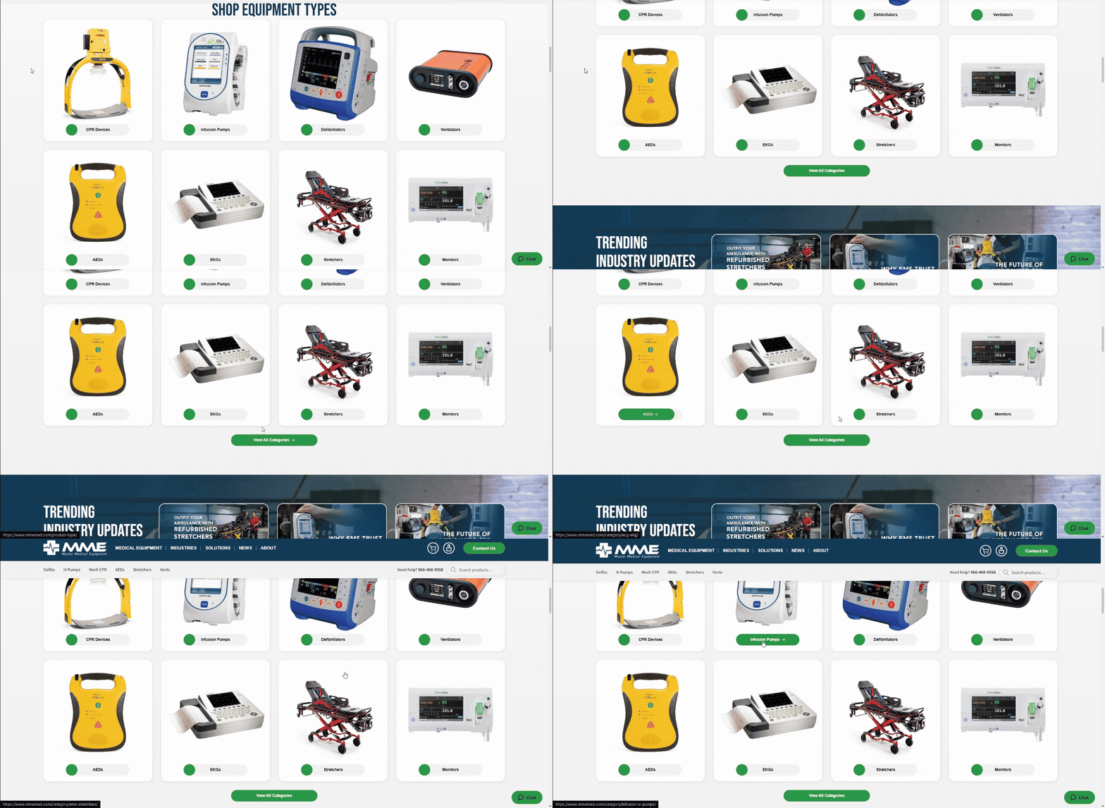
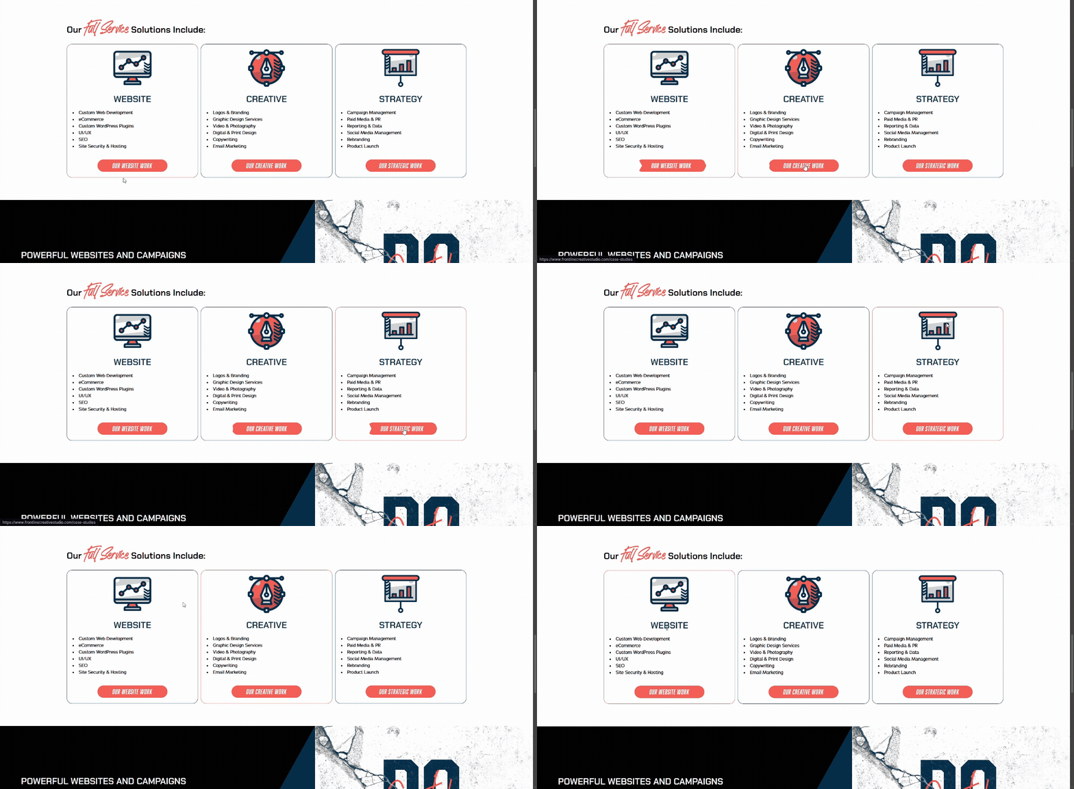



Header Field
Accepted Content
- Text
Notes
Appears at the top of the section above the tiles. Supports custom text formatting by wrapping text in double asterisks **Like This**. An example of that is the fancy text on the Frontline site.
Body Field
Accepted Content
- Text
- Link
Notes
Appears below the header and above the tiles. Rich text editor, supporting things like bold and italics.
Tiles Field
Notes
This will cover everything that can go on a tile.
- Image Shape
- Determines the shape of the image. Options are Rectangle, Circle, or Squircle (rounded square)
- Image
- Image Link
- Optional link for the image. If left blank, will default to the Button Link if it is set.
- Image Hover
- Determines if a separate image displays on hover
- Hover Image
- The image that displays on hover
- Header
- Header text below the image within the tile
- Body
- Body text that displays below the tile header
- Button Class
- Custom class for button styling
- Button
- Displays at the bottom of the tile. If set, the image will also link to the button link unless Image Link is set separately
Button Field
Accepted Content
- Text
- Link
Notes
Displays below the tiles.
Theme Field
Notes
Determines the background color. There are Light, Gray, and Dark themes. The colors of these themes can be adjusted on a site-by-site basis.